Redlining: no, it’s not an actual red line on your sidewalk separating one neighborhood from the next, but it might as well be. There is perhaps no better time than now to expose the racial inequalities that resulted from redlining and related practices.
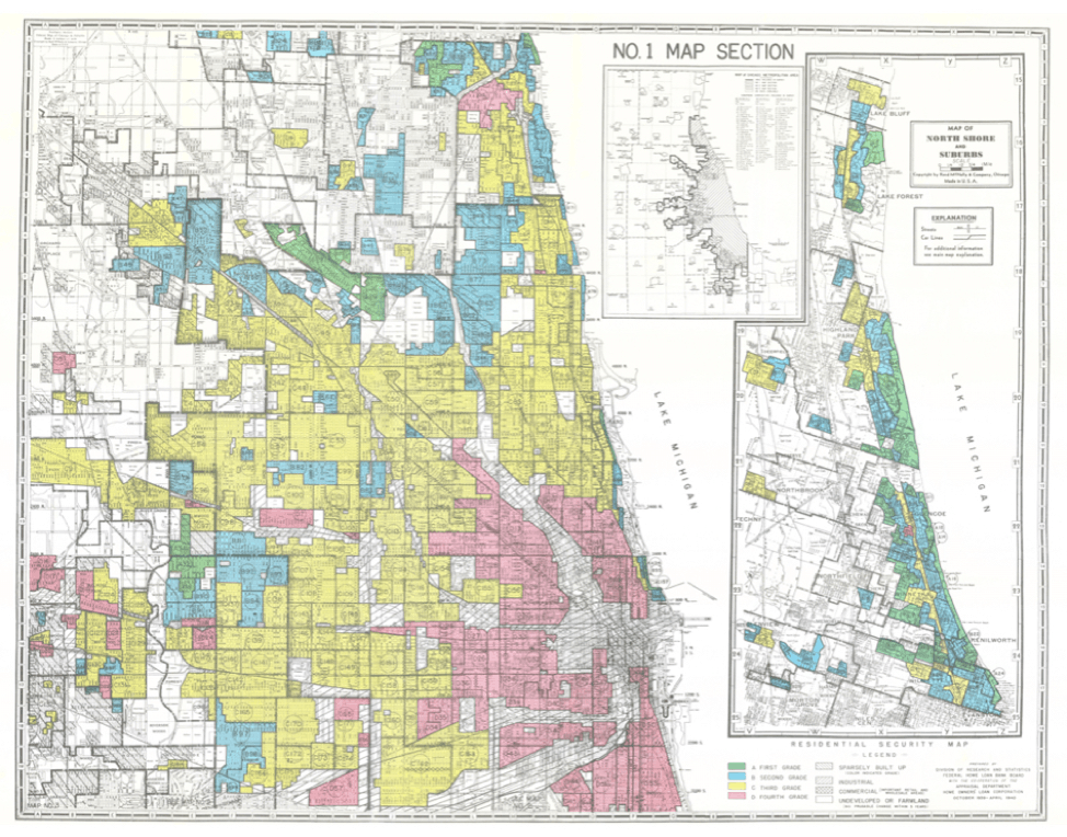
Redlining was the systematic denial or selective raising of prices on numerous financial services (mortgages, loans, etc.) to target residents in predominantly low- and moderate-income or African American neighborhoods. In the wake of the Great Depression, a now defunct federal agency, the Home Owners Loan Corporation (HOLC), constructed maps for 239 of America’s largest cities, dividing them into four categories (“hazardous,” “definitely declining,” “still desirable” or “best”) based on perceived credit risk. Neighborhoods with the lowest grade––hazardous––were colored red on the maps. Many of the hazardous red-shaded areas were majority African American and immigrant neighborhoods.
The consequences of redlining are often thought of in terms of economic opportunity and segregation, but these consequences extend far beyond the boundaries of socioeconomic inequality and into the realm of health disparities. While many studies have been conducted on the relationship between segregation and health, not much has been done to directly examine the current indications of health within the HOLC’s redlined neighborhoods.
One study looked at mortgage discrimination, a measure of redlining, and the health of Americans of Chinese heritage in Los Angeles but didn’t explore the historically redlined neighborhoods using the HOLC maps. Two recent studies have looked at the incidence of preterm births and asthma for minorities living in HOLC hazardous classified neighborhoods and found that the people living in redlined areas had adverse health outcomes. Aside from these few studies, little research has been done on health outcomes for people living in the HOLC graded neighborhoods. It’s important to look at this linkage, as these historical maps are an example of how systematic segregation was implemented and how the HOLC concentrated discrimination in specific, racially associated neighborhoods.
I focused my attention specifically on the extent to which redlining practices were associated with higher instances of diabetes, obesity and hypertension in Chicago. I conducted a spatial analysis by using the QGIS software to overlay the HOLC map and a map of community areas (relatively small geographical boundaries used for statistical and planning purposes) of Chicago. Each community area was placed into a quintile, based on the value of each health variable (rates of diabetes, obesity and hypertension).
If the HOLC map grades correlated with diabetes, obesity and hypertension rates, than more of the lower graded HOLC areas (hazardous and definitely declining) would have the highest percentile of negative health rates. Thus, they would be located in a higher quintile (4 or 5). Conversely, more of the HOLC highly graded areas (still desirable and best) could be expected to have lower percentages of negative health rates and be in the lower quintiles (1 or 2).
My analysis indicated this wasn’t exactly the case, but it was close. Over 90% of the HOLC-labeled best neighborhoods were located in quintiles one or two, indicating lower rates of each condition. There were no clear trends for the other categories, though there was generally a higher percentage of hazardous and definitely declining neighborhoods in quintile five as opposed to one.
I thought there might have been a more clear relationship between hazardous neighborhoods and higher negative health rates since the opposite was true for “best” neighborhoods. Maybe there is; perhaps such an association exists but it was beyond the limits of the data I had available for study. It is also possible that the results were skewed because such a large portion of Chicago was graded as low HOLC neighborhoods. Thus, without enough variability, such distinctions could not be made.
A few other studies have shown that historic redlining practices are correlated with current economic and health disparities. One study found that rates of emergency department visits due to asthma were 2-4 times higher in hazardous areas than best areas. Another, from NCRC, found that 74% of the neighborhoods classified as hazardous are low- and moderate-income today.
Your social determinants of health, where you live, work and play, can contribute significantly to your physical, mental and financial health outcomes and risks. For decades, African American communities were stripped of the resources they needed to prosper. Years of disinvestment leaves lasting impacts that do not organically dissipate. Racial division still bears its ugly teeth in the face of our society. We need to address the root causes of the perpetual inequality and segregation in America. Redlining is one of those causes. If in America, we ever want to achieve racial and class health equity, we must continue to explore the ways that discriminatory practices such as redlining continue to influence health disparities.
Julia Perrino is a high school student in New York.
Photo by University of Richmond’s “Mapping Inequality” project
