Decades of Disinvestment:
Historic Redlining and Mortgage
Lending Since 1981
May 2024
Bruce C. Mitchell, PhD, Principal Researcher, NCRC
Jad Edlebi, GIS Data Engineer, NCRC
Helen C.S. Meier, PhD, MPH, Assistant Research Scientist, Survey Research Center, Institute for Social Research, University of Michigan
Jason Richardson, Senior Director, Research, NCRC
Liang Chen, Postdoctoral Research Fellow, Survey Research Center, Institute for Social Research,
University of Michigan
Partial funding for the research in this publication was supported by the National Institute on Aging of the National Institutes of Health under award number R01AG080401. The content is solely the responsibility of the authors and does not necessarily represent the official views of the National Institutes of Health.
— Key Takeaways
Lenders continue to reinforce patterns of structural racism in formerly redlined neighborhoods, regardless of local market dynamics. Fifty-five years after Congress outlawed using discriminatory maps to guide mortgage lending, race-based exclusion from homeownership is still a de facto reality.
Policymakers and analysts can now definitively and precisely connect present-day conditions to past structural discrimination. The new HMDA Longitudinal Dataset (HLD) created to make this report possible clears up data deficiencies that have stymied our understanding for decades.
In light of these findings, it is imperative to implement and firmly enforce better-designed policy measures aimed at mitigating the impact of redlining and addressing residential segregation. Recent enhancements to the Community Reinvestment Act (CRA), and the long-awaited Affirmatively Furthering Fair Housing (AFFH) rules yet to be finalized by the US Department of Housing and Urban Development (HUD), are important steps to mitigate the impact of redlining and diminish residential segregation in communities. But they may not be sufficient on their own, given the stickiness of redlining’s legacy over the half century since the Fair Housing Act (FHA) became law.
Introduction
Those who insist that overt racist repressions of the past have become irrelevant with the passage of time have long enjoyed a rhetorical advantage. The lived experiences of non-White people in the 21st century are difficult to quantify because the data that anchors such debates is so noisy.
That changes now, at least in the key policy sphere of homeownership. This report uncovers evidence that has for generations been locked away behind inconsistent reporting categories and mismatched geographic designations.
The significance of this breakthrough requires context and explanation.
Redlining was one of several practices and policies which were instrumental in the creation of existing patterns of residential segregation. Maps created by the Home Owners Loan Corporation (HOLC) 90 years ago document the federal government’s development of redlining which codified less-formal local practices of exclusion and lending discrimination, perpetuating and expanding segregation and inequality nationwide. Discriminatory lending practices predate HOLC. The roots of redlining stretch back to the enslavement and exploitation of African Americans over the centuries, and to the xenophobia of many Americans toward many immigrant groups. This history of economic and social injustice laid the groundwork for many of the disparities we see today.
These discriminatory practices were not outlawed until 1968. More than 50 years later, the socioeconomic stain they left has not washed out. Communities continue to be affected by the disparities in mortgage lending associated with residential segregation and the practice of redlining – as people living in such neighborhoods today know all too well.
But while the anecdotal evidence of long-term harms from past redlining is ample, precise quantitative analysis of the connections between the present and past has long been difficult. Researchers have faced a structural headwall: It became illegal to blanket-deny home loans to Black neighborhoods in 1968, but another 13 years passed before anyone gathered data on where home loans were getting made and to whom. Even after the Home Mortgage Disclosure Act (HMDA) came into effect in 1981, data requirements and geographic boundaries shifted so often that it was difficult or impossible to make apples-to-apples comparisons.
Impossible, that is, until now.
This report introduces a new HMDA Longitudinal Dataset (HLD) which cleans up the noise left by serial shifts to HMDA rules and Census boundaries. Created with funding from the National Institutes of Health (NIH grant AG080401), the HLD breaks down barriers that have impeded a wide range of policy efforts beyond the capital and housing markets themselves – to include public health, sociology and political science. Researchers, advocates and policymakers can now reach conclusions regarding complex questions spanning a multigenerational time period, where previously such inquiry was constrained to smaller time windows or hampered by mismatched geographic and ethnographic parameters. We are excited to see what questions our peers in other fields might think up to tackle using this resource.
For now, though, we can begin by answering one of the key questions for the community development professionals and racial economic justice advocates who the National Community Reinvestment Coalition (NCRC) represents: Why does mortgage lending in formerly-redlined neighborhoods still lag levels found elsewhere? Is it because those neighborhoods are authentically different as housing markets – with older housing stock, more renters, less new development activity, etc. – or are redlined communities getting even less lender attention than others once adjusting for those factors?
We found that over the past four decades the average redlined neighborhood got about 3,000 fewer mortgages than those deemed as the ‘Best’ by the HOLC mapmakers – after leveling out legitimate market factors related to housing availability.
In other words, lenders are under-serving pockets of America that were historically marginalized. In the time when the HOLC was active, those pockets included the Black descendants of American chattel slavery, but also immigrant groups considered undesirable by many Americans. Today, these places remain marginalized and are overwhelmingly populated by Black and Brown people. Redlining established decades-long patterns of disinvestment in many minority neighborhoods – creating a self-fulfilling prophecy of racial and economic segregation and disadvantages.
How can households in redlined areas build wealth if they remain de facto excluded from lending despite a robust legislative structure intended to ensure those very families can become homeowners? How can our country close the enduring racial wealth divide without curing this lingering disparity in access to credit?
This study – taken together with NCRC’s previous work on segregation and economic disadvantage in redlined neighborhoods – is an indictment of the operation of structural racism in American neighborhoods well into the 21st century.
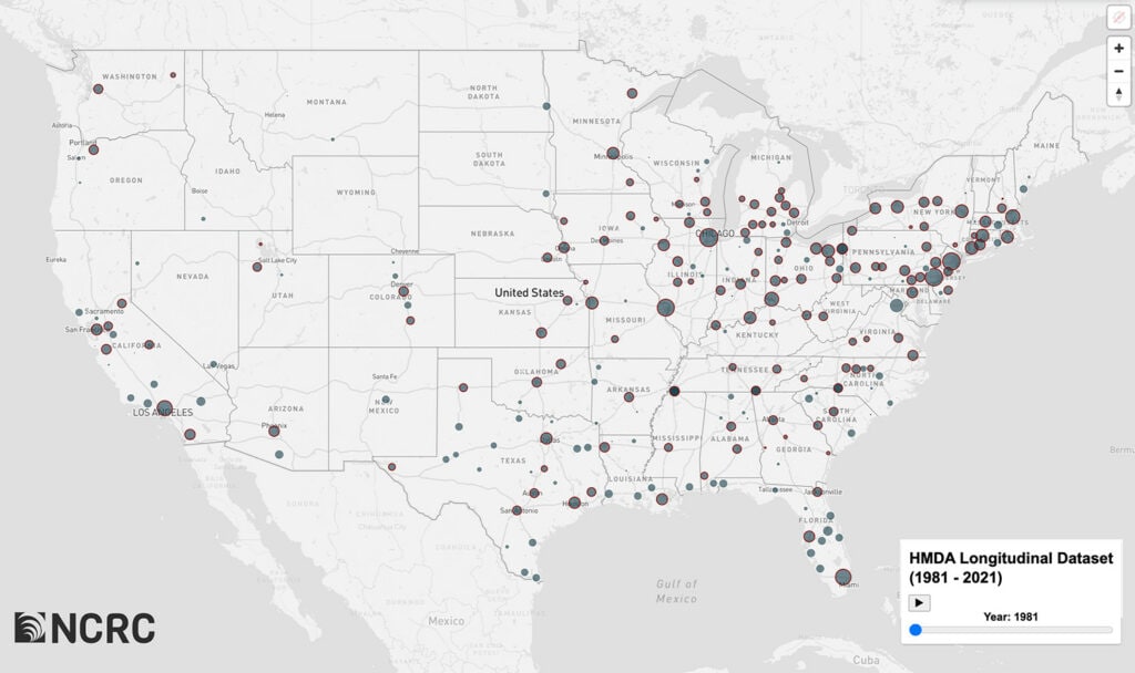
HMDA Originations By Year With HOLC Redlined Areas: 1981-2021
Past Redlining and Present Inequity
Homeownership is a primary avenue to building wealth. In 2021, the value of the equity amassed through owning a home accounted for about 45 percent of the median net worth of homeowners overall. This figure climbs even higher for Black and Hispanic homeowners, constituting 63 percent and 66 percent of their household wealth respectively.[1] The importance of homeownership equity in wealth accumulation underscores the role it plays in perpetuating the racial wealth gap (Figure 1).[2] As of 2022, Black households held a mere $15 for every $100 in wealth held by their White counterparts.[3]
Figure 1
Racial disparities in homeownership are a major contributor to the racial wealth gap. Despite the heightened reliance of Black and Hispanic households on homeownership for wealth accumulation, the gap in homeownership rates is substantial. Black homeownership made significant strides during the 20th Century, peaking in 1980. But this progress eroded over the past 20 years resulting in a decrease in the Black homeownership rate from 53.9 percent in 1980 to merely 47.0 percent by 2020. The gap between Black and White homeownership levels was wider in 2020 than it was in 1900 (Figure 2).[4]
Figure 2
Redlining is an important historical factor which contributed to both the homeownership and wealth gaps between White and non-White America. The term “redlining” refers to practices that deny households access to credit based on the neighborhood that they live in, not their individual creditworthiness. This systemic barrier perpetuated a cycle wherein Black and immigrant households were confined to segregated neighborhoods with lower home values, exacerbating the wealth gap and impeding intergenerational wealth transfer.[5] Historically, the opportunity to own a home was made available to millions of White households in the post-war period through Federal Housing Administration (FHA) and Department of Veterans Affairs (VA) lending – but Black households were for decades mostly excluded from access to federally-backed and private mortgages.[6]
Extensive and prolonged racial discrimination in mortgage lending further entrenched residential segregation in American cities. This segregation has wider negative effects beyond the first-order limiting of opportunities for enhancing wealth by accumulating equity through homeownership. It in turn fostered disparities in neighborhood access to education[7] and employment opportunities[8] and created health disparities due to lack of access to quality healthcare[9] and exposure to environmental stressors and hazards.[10] Racial segregation was established and maintained by a complex interlinkage of social practices and norms with concrete policies at the federal, state and local levels. The legal structures, public policies and business practices involved in residential segregation included racially restrictive deeds and covenants on the sale of property, land use and zoning restrictions, real estate steering,[11] social pressure, violence and redlining.
Redlining was widely practiced by both the federal government and private lenders for decades until it was made illegal by the Fair Housing Act of 1968. The most notable example of the true extent of redlining is contained in the structured classification system and “residential security maps” created by the HOLC during its “City Survey” project completed between 1936 and 1940. The HOLC maps were filed by government employed field agents, who relied upon local realtors, lenders and city employees to provide information about neighborhood valuations, conditions and demographics.[12] The map of Shreveport, Louisiana, is an example of an early HOLC map listing the local contributors to the grading (Figures 3a, 3b, 3c). The HOLC grading system reflects local knowledge of the communities being graded, and provides much detail on neighborhood composition and how classification decisions were made.[13]
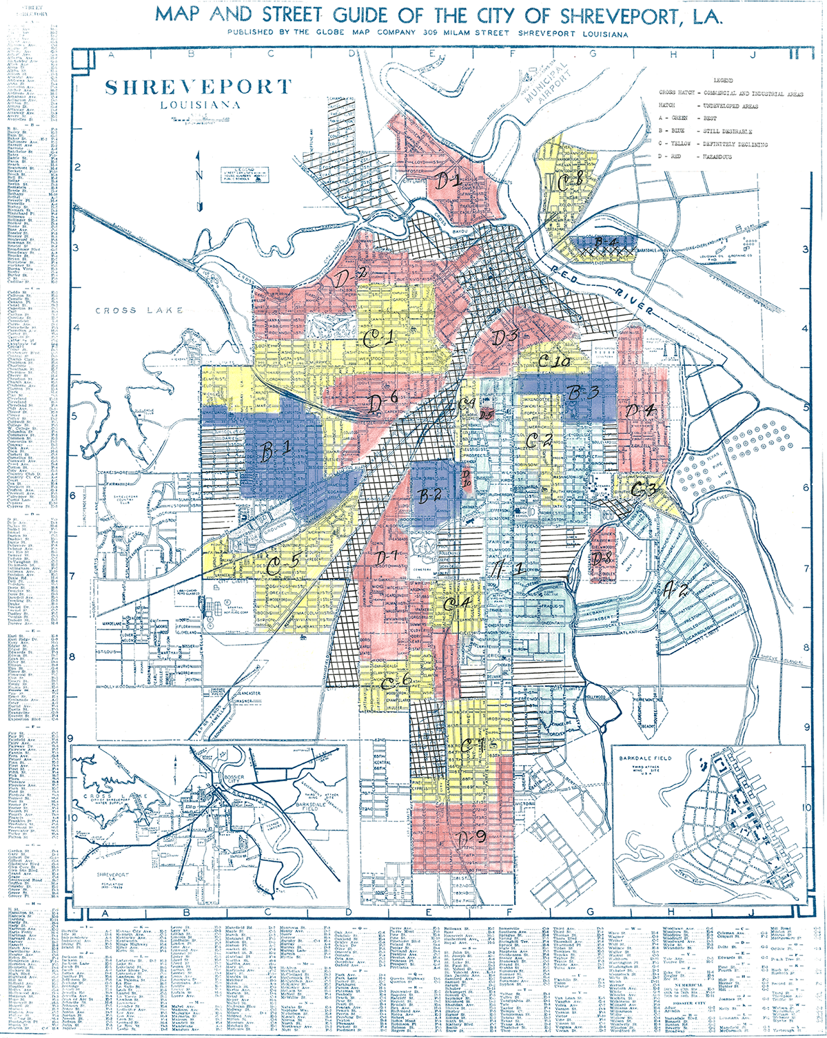
Figure 3a: Undated HOLC residential security map of Shreveport, LA. This map was probably made prior to standardization of the grading sheet.
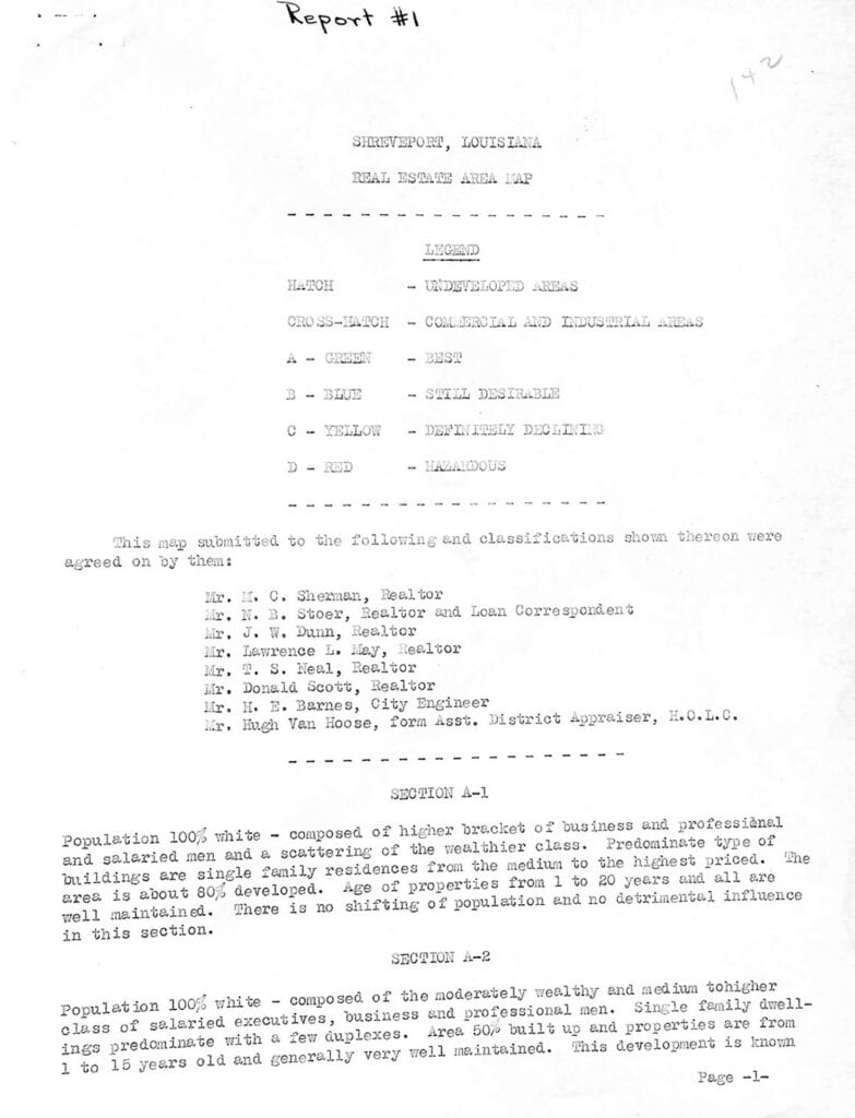
Figure 3b is an example of how the local real estate community acted as key sources of information regarding neighborhoods and their classification. In the case of Shreveport, six local realtors, one of whom was a broker and the city engineer contributed to the neighborhood classifications used by the HOLC field agent.
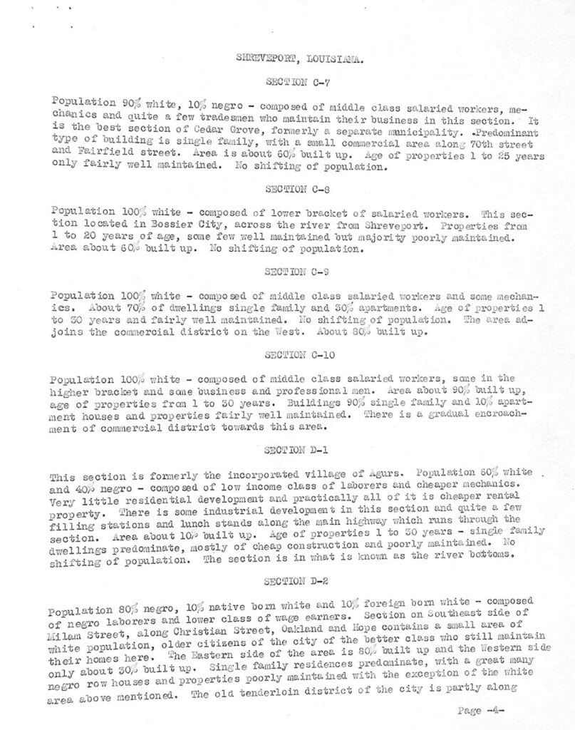
Figure 3c displays the comments made on the “D” or “Hazardous” graded neighborhoods of the city. The HOLC grading system reflected local understanding of which neighborhoods would be redlined by lenders.
The map of Atlanta (Figure 4a & 4b) is an example of the standardized HOLC grading sheets introduced by the “City Survey” project, and was created later than the Shreveport map. These grading sheets instituted greater uniformity in neighborhood assessments. In Atlanta, neighborhoods with any Black residents were downgraded to a “D” or “Hazardous” rating. The HOLC grading sheet for the area around Clark University shows that despite the presence of the school and high levels of homeownership, it was still classified as “Hazardous” with a recommendation that the HOLC sell any properties held there. The evolution of federal real estate valuation was gradual, and the HOLC and FHA worked together to develop the institutional logic of racial discrimination in mortgage lending.[14]
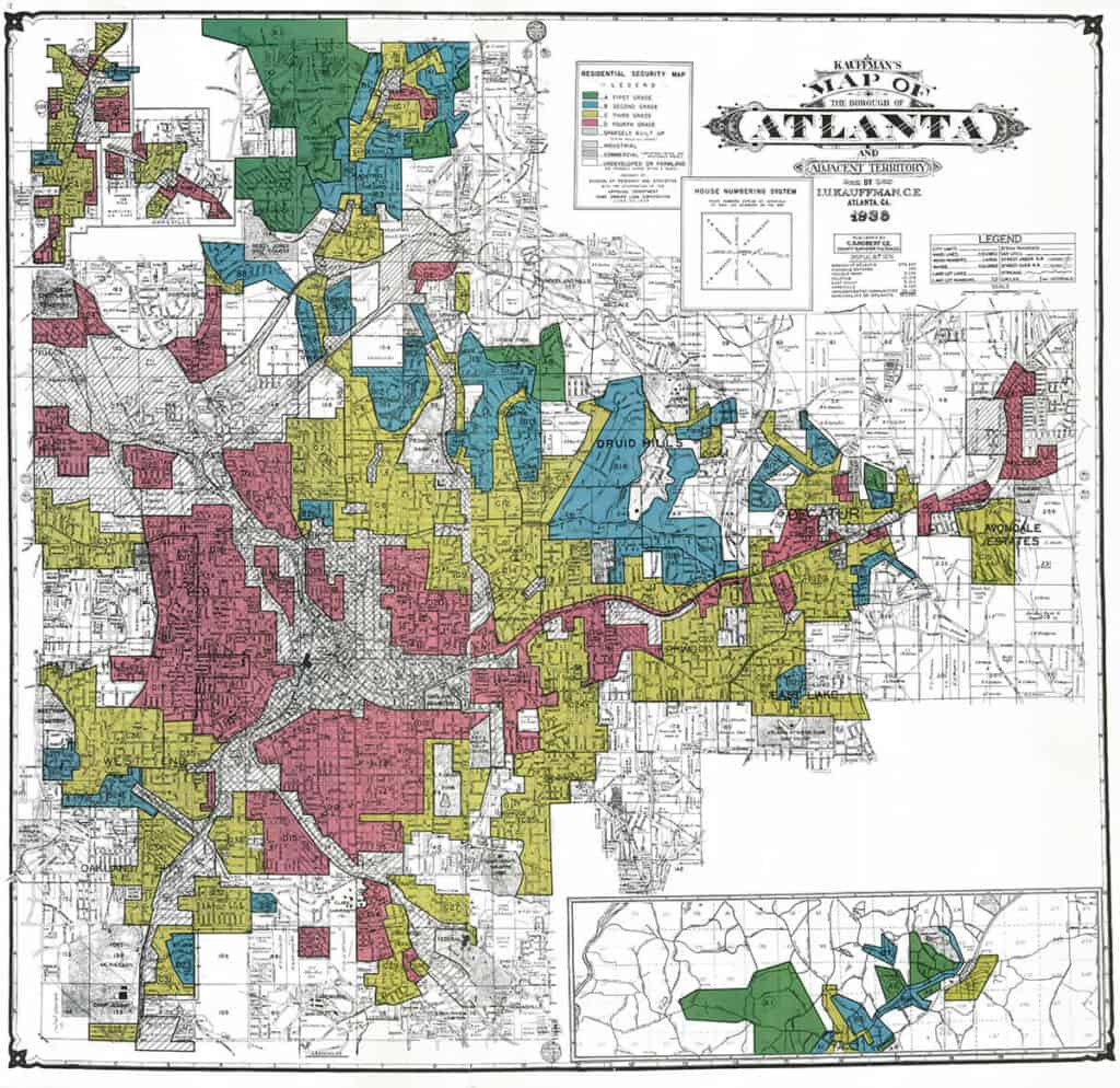
Figure 4a – HOLC residential security map of Atlanta from 1938
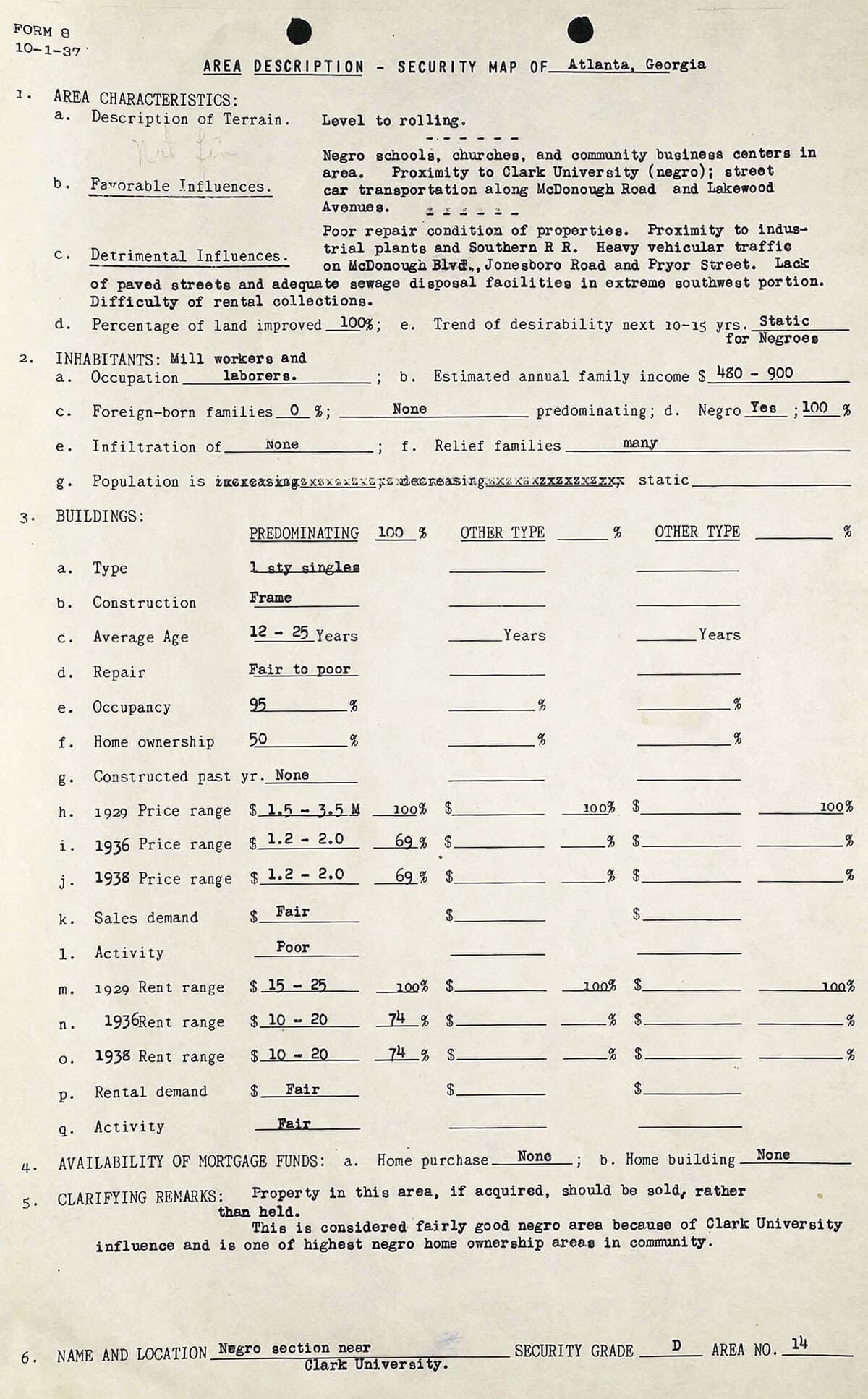
Figure 4b – HOLC standard grading sheet for neighborhood section D14 in Atlanta. The HOLC and the FHA worked together to standardize their methods, institutionalizing the logic of racialized mortgage risk appraisal which lasted for decades.
In the period following creation of the HOLC maps – the post-war period – after two decades of depressed housing construction there was an explosion in the demand for modern housing as America entered the “Baby-boom” era of extensive suburbanization. Opportunities to build wealth through increasing home equity were available to a generation of American families, an opportunity that bypassed Black people because of segregation and redlining. The “institutional logic of racial segregation in mortgage lending” had been fully developed.
But why focus on the maps created by the HOLC? The maps are over 90 years old, and much has changed since the 1940s. Besides, there is little evidence that the HOLC discriminated in its lending, because most of its loans were made before the maps were created.[15] The best evidence is that the HOLC and FHA – which extensively discriminated in its lending – worked together to formalize and promote underwriting standards that embedded racism in the mortgage process.[16] These federal agencies held conferences, published articles, created the redlining maps and adhered to underwriting manuals – all of which promoted a segregationist mindset favoring lending to White families in White-only areas. Recent scholarship by the National Bureau of Economic Research (NBER) has shown how closely FHA lending in the 1940s adhered to HOLC maps in the cities of Baltimore, Greensboro, North Carolina, and Peoria, Illinois, with little lending in the “Hazardous” graded areas of those cities, but robust lending elsewhere.[17] Consequently, the HOLC redlining maps are a valid guide to which neighborhoods of cities would have been considered by the lending community as both good and bad credit risks – and a predictor of where investment in housing flowed during post-war suburbanization, right up until 1968.
Because housing endures for decades, these neighborhood risk evaluations at the local and federal levels established patterns of investment and disinvestment which lasted for decades, extending far beyond the direct effect of shaping who did and did not own their own home: Neighborhoods qualified as “Best” by the mapmakers would have had higher tax bases, and the better-funded schools and other public services those taxes supported would have helped make for more robust and stable local economic activity. Places graded “Hazardous” by the mapmakers would have faced a higher degree of difficulty to generate those same virtuous cycles that are the foundation of human prosperity. The HOLC city-survey maps and FHA policies are a clear example of the operation of structural racism in the housing market, the effects of which impacted how American cities developed, shaping exposure to harms and access to opportunities. Redlining by private banks and federal agencies was a key part in the creation of urban residential segregation which persists to this day.[18]
Cutting Through The Noise: A New Solution To Challenges In Prior Research
Given this historic example of discrimination and disinvestment, have the HOLC graded “Hazardous” areas received fewer mortgage originations in recent decades? Have the communities that were set up to fail at developing virtuous-cycle local economics managed a ‘reset’ of mortgage activity that could support a bounceback in the near future?
A few studies have been published on racial disparities in mortgage approval rates,[19] and in interest rates and fees.[20] Studies on this issue have been hampered by the limited availability of individual credit-scoring data. Federal agencies and credit data analytics firms like Experian, Equifax and Transunion have access to a more complete dataset of mortgages and credit scoring data. Consequently, researchers and advocates rely on studies such as the one completed in the early 1990s by the Federal Reserve Bank of Boston. It found that while debt burden, credit scores and higher loan to value ratios did explain part of the racial disparity in mortgage denials, they failed to provide a complete explanation.[21] However, a more recent Urban Institute study assessing denial rates came to a different conclusion. Urban’s study weighed multiple factors, like lending channels (conventional lenders versus government mortgages), and credit scoring to present a nuanced picture of factors which enter into mortgage credit decisions.[22] The contrasting findings of these two studies provide an example of the difficulty of analyzing the mortgage lending approvals.
The lack of full data, combined with the complexity of decision-making in the mortgage approval process, clouds our ability to see the whole picture regarding individual mortgage approvals. Structural considerations – the preponderance of factors which over time have created barriers to credit access – are clearly a factor in racial disparities in mortgage originations.[23] For instance, a study by the Federal Reserve Bank of Chicago compared higher and lower HOLC-graded neighborhoods, finding that segregation significantly increased in redlined neighborhoods.[24] Additionally, the study found that declines in home values, credit scores and levels of homeownership in the lower graded neighborhoods persisted over the decades, with these effects being most notable in the redlined “Hazardous” and yellow-lined “Definitely Declining” graded neighborhoods.
Our study explored disparities in the number of mortgage originations in ungraded and in HOLC graded neighborhoods since 1981. We asked: Are historic HOLC neighborhood grades associated with a lower number of mortgage loans in recent years when we compensate for factors of housing availability? Using the new HMDA Longitudinal Dataset (HLD) to establish consistent geographic boundaries for census tracts across decades, and a Historic Redlining Indicator (HRI) to assess the comparative level of HOLC grading, we test whether modern mortgage lending varies by historic HOLC grades after accounting for the number of housing units, levels of vacancy, homeowner occupancy and the age of the housing stock. Our study found a statistically significant decrease in the number of mortgage loans across neighborhoods that were formerly redlined by HOLC.
The lowest number of loans were observed in areas labeled as “Hazardous” 90 years ago.This relationship persists across the last four decades. When these results are coupled with our past studies of redlining, segregation and economic disadvantage and of the associations between redlining and adverse public health outcomes it underlines the interlinkage of structural racism and residential segregation in America’s urban structure – and suggests that market and policy actions taken since the de jure end of redlining have not achieved a de facto resolution. Without such resolution, the same patterns of disinvestment described above – and of compounded racial disparities in health and wealth described in our other research – are likely to continue into the future.
Analysis
Our analysis assessed mortgage lending in HOLC graded and ungraded neighborhoods from metro areas across the nation over several decades. Supported by a National Institutes of Health grant with our partners at the University of Michigan (AG080401), NCRC created a new dataset of mortgage lending based on the federal reporting covering the last 40 years. Since 1981, data reported by banks, savings and loans, credit unions and mortgage companies has been made available through requirements of the Home Mortgage Disclosure Act (HMDA). This resource is the most comprehensive in its coverage of the mortgage lending market, with an estimated 80 to 90 percent of the loans made in rural and urban areas being recorded.[25]
However, because reporting guidelines have changed and the reporting boundaries shifted over the years, a complete dataset for analysis of past lending patterns at the census tract level did not exist. The HMDA Longitudinal Dataset (HLD) was created to allow such a comparative analysis over decades. It includes mortgage loans made for owner-occupied, single family homes that were site built (not manufactured homes). The decadal data from the HLD is combined with information from the Historic Redlining Indicator (HRI), which evaluates the degree to which census tracts were overlapped by the HOLC grades. The redlining scores are provided in intervals from 1-4, with 4 representing tracts that were extensively or completely graded as “Hazardous”, or redlined in the federal maps. Conversely, census tracts in interval 1 were primarily graded as “Best,” while 0 represents ungraded tracts – most of which were developed in decades after the HOLC completed its activities.
Descriptive Patterns
The average number of mortgages made at the census tract level changed substantially over the decades. A bar chart of mortgage originations (Figure 5) clarifies the pattern as demand ebbed and flowed over time, but it also indicates changes to the HMDA program itself. In the 1980s, the low decadal average of only 340 mortgages per tract was caused by problems with the HMDA program reporting standards, which were evolving after their initial implementation, and the reduced demand for mortgages during an era of high interest rates and inflation. Subsequent decadal averages of the 1990s and 2000s indicate a recovering market, but the housing bubble evolved in the mid-2000s, crashing during the housing crisis of 2007-2008. The decade since 2010 reflects recovery, then a substantial increase in lending until 2019, as interest rates declined to unprecedented levels, and lending to refinance mortgages and purchase homes spiked.
Figure 5
America’s supply of newly built structures has declined over decades, as the examination of several issues related to housing captured in Figure 6 reveals. The percentage of housing units 30 or more years old has increased as construction has decreased. In 1980, only 40 percent of US housing stock was 30 years old or older, but this rose to over 70 percent by 2019. During the same period there was no increase in the percentage of multi-family dwelling units, with less than a 1 percent fluctuation in the availability of this type of housing. Meanwhile, owner-occupancy increased slightly. The average number of vacancies has fluctuated not more than 4 percent over the period.
Overall, these numbers demonstrate the failure of the US housing system to produce sufficient new housing. The results are an aging housing stock and a static proportion of multi-family housing.
Figure 6
In terms of mortgage lending activity, the average number of mortgage originations per census tract made in the decade since 2010 is 1,040. This is slightly higher than the number made during the 1990s, and considerably higher than the average of 340 loans made in the 1980s (appendix table A-1). We adjusted the number of mortgage originations to reflect the number of housing units in the census tract, and then categorized the adjusted figures by decade and by the HOLC grade. A striking pattern appears when the originations are categorized in this way (Figure 7). In areas graded by the HOLC, there is a clear pattern where neighborhoods rated as “Best” receive the most loans. As the grades decrease, the number of loans also decreases, with the lowest-graded “Hazardous” neighborhoods receiving the fewest mortgages.
This pattern, where each step down in grade corresponds to fewer loans, is described as a monotonic relationship. Monotonic means that the relationship between two variables moves in a single direction, either always increasing or always decreasing, without reversing. This consistent trend has been observed decade after decade. The only categories of place where loan numbers exceeded the “Best” graded neighborhoods were the ungraded neighborhoods in the 1980s through 2000s. The ungraded census tracts largely consist of areas that were developed after the HOLC maps were made – suburbs with larger numbers of newer housing stock.
Figure 7
In order to better understand these relationships at the local level, a dynamic map allows visualization of lending in neighborhoods with their HOLC grade, and the percentage of people of color living there.
HMDA Originations By Year With HOLC Redlined Areas: 1981-2021
While this pattern is evident at the national level, it also appears when data for individual cities graded by the HOLC are examined. As an example, mortgage lending in Milwaukee is shown below (Figures 8a & 8b). There are notably fewer mortgages in both redlined neighborhoods and areas with higher percentages of people of color in Milwaukee (figure 8a). The monotonic pattern of the chart makes this disparity explicit, lower levels of mortgage lending over the decades in each successively lower HOLC grade throughout this metropolitan area (figure 8b).
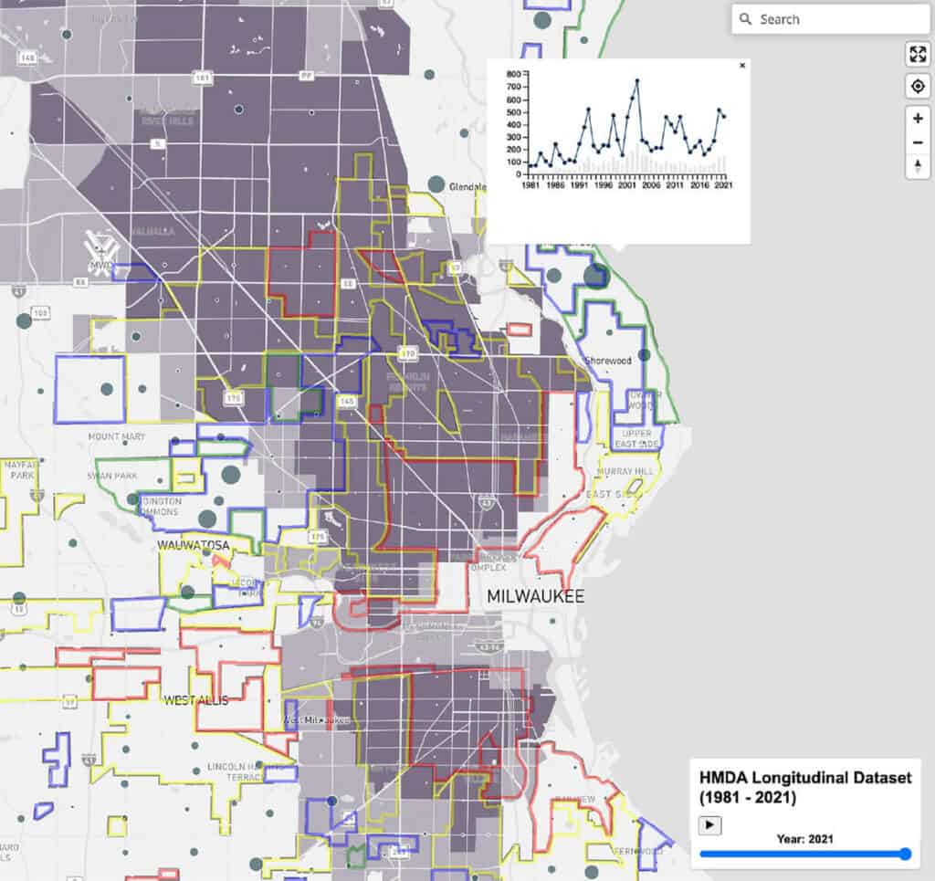
Figure 8a – Milwaukee originations in 2021, with HOLC graded, and minority areas.
Figure 8b – Mortgage lending volume by decade in HOLC graded areas.
Statistical Tests
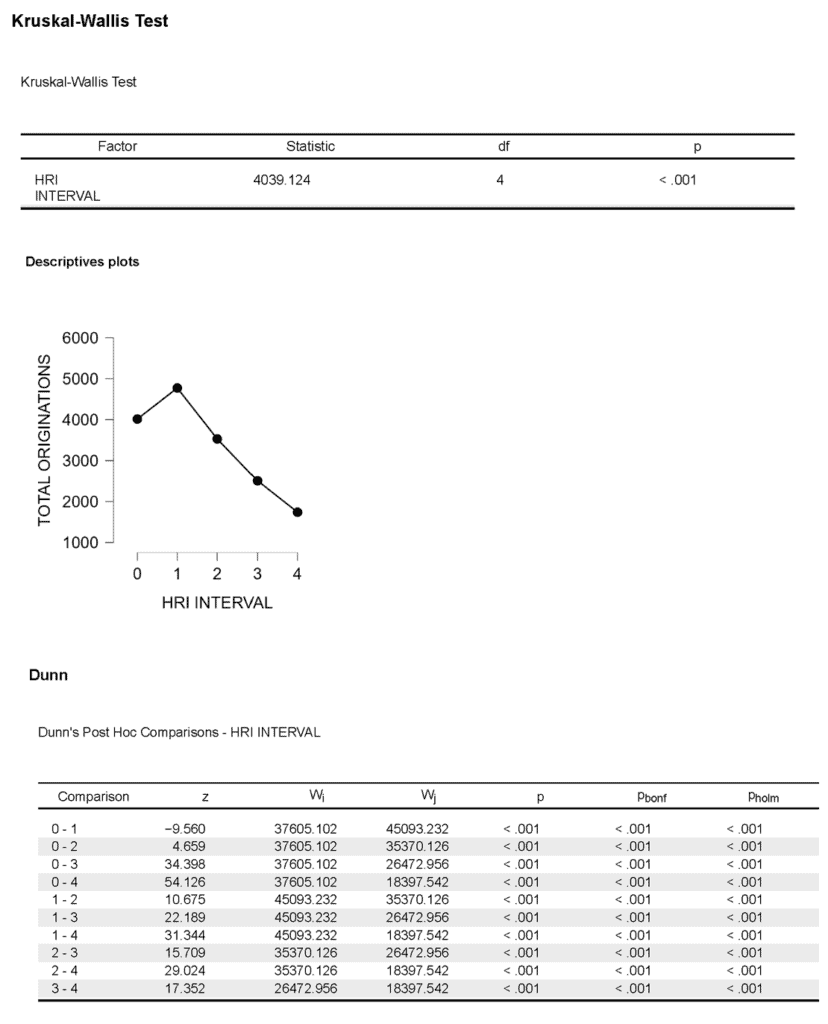
While the data presented above show differences in the level of lending across HOLC categories, do these differences meet the criteria of statistical significance for the relationship? In other words, can we be confident that the results really reflect differences in mortgage lending between the different grades that the HOLC used to define neighborhoods? We conducted several statistical tests including the Kruskal-Wallis test to assess whether the differences in the numbers of originations met the standards for statistical significance. The standard that we used was a 99.9 percent probability that a relationship between mortgage lending and redlining grades existed. First, we tested differences across grades for the total originations for the entire dataset spanning four decades (Appendix A-2). We made comparisons between ungraded and the different HOLC graded areas. Differences in the number of originations between these grades were statistically significant across all areas. For instance, the differences between ungraded and “Best” areas were negative, and significant, with a difference in the median amount of -757.475, meaning that there were significantly fewer loan originations in the ungraded census tracts compared to the “Best” areas over time – equating to an average of over 757 loans over the four decades. While this relationship was not consistent across individual decades,[26] in aggregate, more lending took place in “Best” graded areas than in any other category, with about 1,243, 2,264, and 3,034 more loans being made there on average than in the “Still Desirable”, “Definitely Declining”, or “Hazardous” HOLC graded areas, respectively. Conversely, the “Hazardous” tracts received fewer loans – 3,034 fewer than in “Best,” about 1,790 fewer than in “Still Desirable” and 770 fewer than in “Definitely Declining”. Census tracts which were redlined had statistically significantly fewer originations, indicating the persisting association of redlining with reduced numbers of mortgage loans.
Comparison differences in mortgage loans by HOLC grade
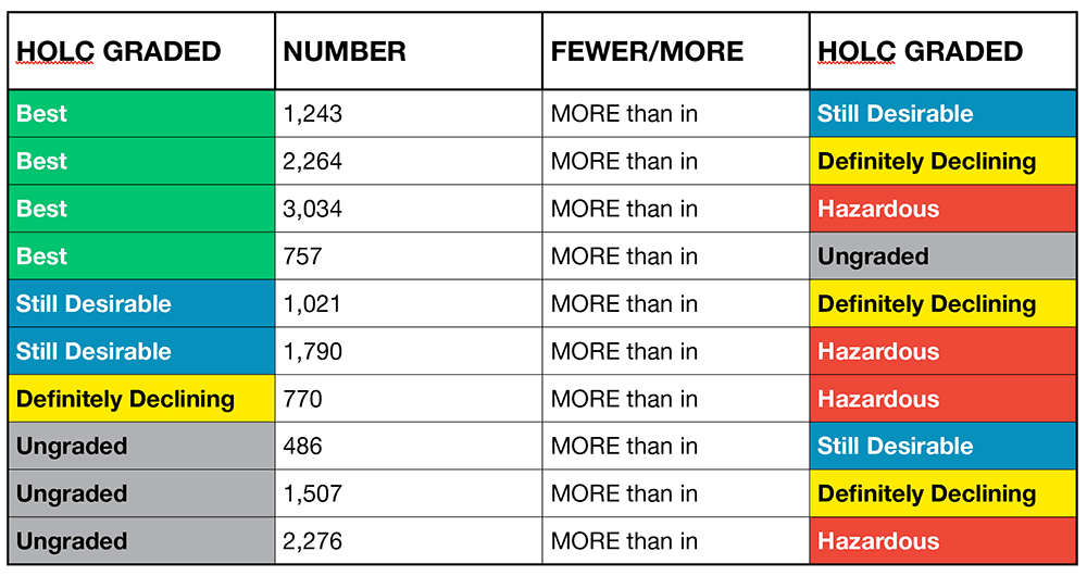
Table 1: Difference in the median number of originations by HOLC grade intervals. Over the past four decades, the median number of loans in neighborhoods graded “Best” by the HOLC was 3,034 higher than in “hazardous” graded, or redlined neighborhoods. (Source: HMDA Longitudinal Dataset, and Historic Redlining Indicator)
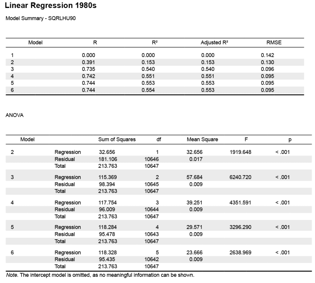
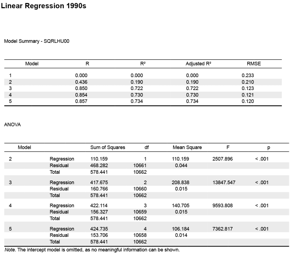
While the data indicates that there are statistically significant differences in the number of mortgage originations made across the HOLC grades, could the differences be explained by other structural factors like housing availability, or whether the housing was in areas with high amounts of vacancy or multifamily properties? We’ve already seen how the age of housing has increased, while rates of vacancy and the percentage of multifamily units have been stable and homeowner-occupancy dropped slightly. Could those issues surrounding availability of housing explain away the differences in origination levels instead of an association with HOLC redlining? And if not – if there was indeed a relationship between historic redlining and the number of originations – has that relationship weakened or diminished over the past four decades of mortgage lending? Linear regression modeling allows us to test these relationships, and determine their relative contribution to the number of mortgages being originated.
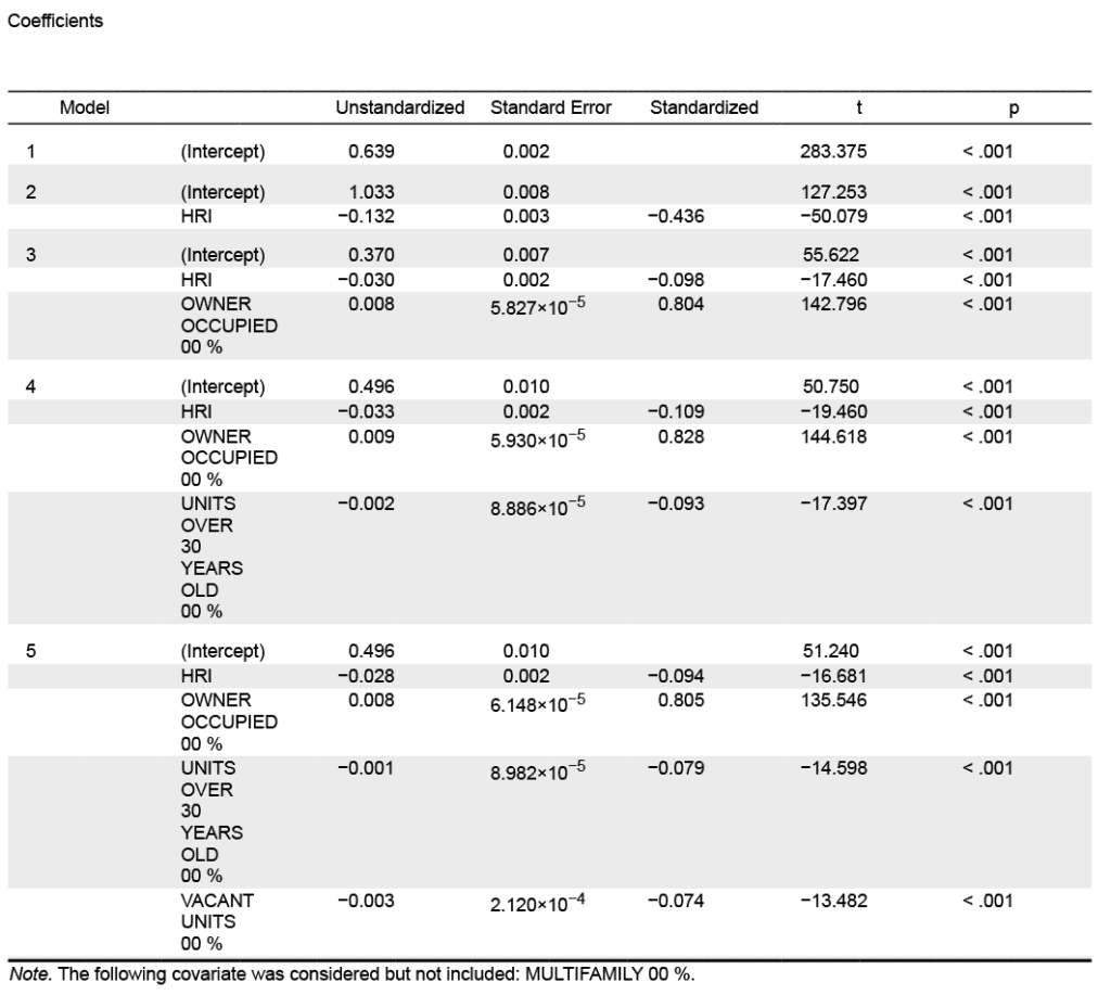
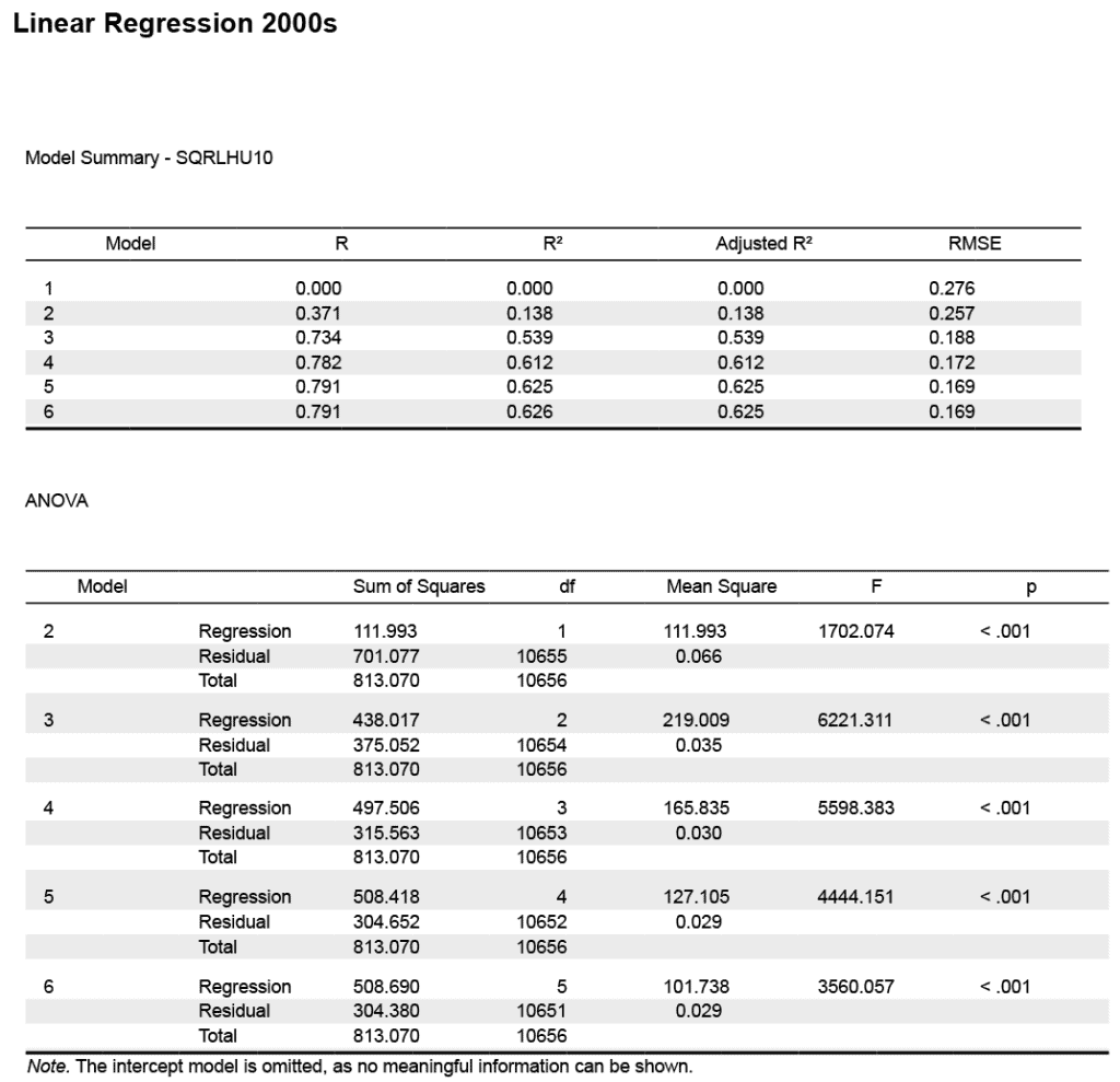
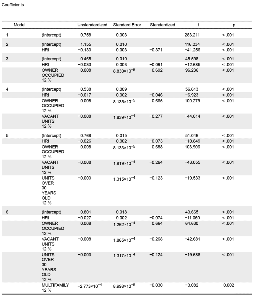
Our linear regression models indicate moderate to strong, and statistically significant correlations between the number of mortgage originations adjusted for the number of housing units and the Historic Redlining Indicator (HRI), and the percentage of owner-occupied housing units across all four decades (Table 2). The column below labeled “adjusted r-squared” is a measure of the strength of the statistical relationship, or the “goodness-of-fit” of the different factors when explaining the association between mortgages and redlining. For the decade of 1981-1990, the three factors of percentage vacancies and owner-occupied units plus the HRI explained 55 percent of the relationship, while the following decade the HRI and percent owner-occupied homes account for 72 percent. This presents a strong relationship for a complex social and economic problem, indicating that the model is quite valuable in our effort to understand the processes and patterns of neighborhood-level mortgage lending. Subsequent decades have only slightly reduced adjusted r-square values.
Table 2: Mortgage originations per housing unit associated with extent of redlining (HRI), rates of vacancy and owner-occupancy, and housing age
All the above models use some combination of the redlining score (HRI) and housing related factors to examine differences in neighborhood-level mortgage lending. What about redlining in and of itself? Each decadal model shows that redlining, as captured in the HRI, is a statistically significant factor. When taken in isolation of the other factors, the adjusted r-squared values are 0.157, 0.181, 0.137, and 0.162. This means that redlining alone contributed substantially to a lower number of mortgage originations across all four decades. Furthermore, the consistency of these measures indicates that the influence of redlining on neighborhood mortgage originations is a persistent factor that has not diminished, even 90 years after the HOLC City Survey program maps were drawn.
Conclusion
Historic redlining continues to exert a profound influence on mortgage lending patterns at the neighborhood-level across American communities. Over the last four decades the neighborhoods graded as “Best” have consistently greater mortgage lending activity compared to all other neighborhoods categorized by the HOLC field agents, even exceeding the average originations of ungraded areas. Conversely, the “Hazardous” graded or redlined areas show consistently worse performance than any of the other neighborhood categories. This underscores the enduring impact of historical discriminatory practices on contemporary housing markets.
Despite accounting for various structural factors within the housing market, the relationship between redlining and fewer mortgage originations persists, challenging expectations of a diminishing impact of redlining as the decades pass. The persistence of this relationship is a stark reminder of the entrenched nature of structural racism within the housing finance system.
Moreover, this study illustrates the interconnectedness of redlining, residential segregation and economic disadvantage in marginalized communities. By limiting access to mortgage credit, redlining has impeded the ability of households in affected areas to build wealth, exacerbating the racial wealth gap and perpetuating systemic inequality.
In light of these findings, it is imperative to implement targeted policy measures aimed at mitigating the impact of redlining and addressing residential segregation. Initiatives such as enhanced Community Reinvestment Act (CRA) enforcement and implementation of the Department of Housing and Urban Development’s (HUD) Affirmatively Furthering Fair Housing (AFFH) rule offer promising avenues for fostering inclusive and equitable housing opportunities.
By addressing the root causes of redlining and promoting fair and equitable access to mortgage credit, policymakers can work towards dismantling systemic barriers to wealth accumulation and fostering more inclusive and equitable communities for all.
References
Aaronson, D., Hartley, D., & Mazumder, B. (2021). The effects of the 1930s HOLC “redlining” maps. American Economic Journal: Economic Policy, 13(4), 355-392.
Aaronson, D., Faber, J., Hartley, D., Mazumder, B., & Sharkey, P. (2021). The long-run effects of the 1930s HOLC “redlining” maps on place-based measures of economic opportunity and socioeconomic success. Regional science and urban economics, 86, 103622.
Crossney, K. B., & Bartelt, D. W. (2005). The legacy of the home owners’ loan corporation. Housing Policy Debate, 16(3-4), 547-574.
Edlebi, Jad, Mitchell, Bruce, Richardson, Jason, Meier, Helen, Chen, Liang, Noppert, Grace, and Gypin, Lindsay. National Neighborhood Data Archive (NaNDA): Home Mortgage Disclosure Act Longitudinal Dataset by Census Tract, United States, 1981-2021. Inter-university Consortium for Political and Social Research [distributor], 2024-05-15. https://doi.org/10.3886/ICPSR39093.v1
Faber, J. (2018). Segregation and the Geography of Creditworthiness: Racial Inequality in a Recovered Mortgage Market. Housing Policy Debate, 28, 215 – 247. https://doi.org/10.1080/10511482.2017.1341944.
Fishback, P., Rose, J., Snowden, K. A., & Storrs, T. (2022). New evidence on redlining by federal housing programs in the 1930s. Journal of Urban Economics, 103462.
Hillier, A. E. (2003). Redlining and the home owners’ loan corporation. Journal of Urban History, 29(4), 394-420.
Krimmel, J. (2018). Persistence of prejudice: Estimating the long term effects of redlining.
Lynch, E. E., Malcoe, L. H., Laurent, S. E., Richardson, J., Mitchell, B. C., & Meier, H. C. (2021). The legacy of structural racism: associations between historic redlining, current mortgage lending, and health. SSM-population health, 14, 100793.
Markley, S. (2024). Federal redlining maps: A critical reappraisal. Urban Studies, 61(2), 195-213.
Michney, T. M., & Winling, L. (2020). New perspectives on new deal housing policy: explicating and mapping HOLC loans to African Americans. Journal of Urban History, 46(1), 150-180.
Michney, T. M. (2022). How the city survey’s redlining maps were made: a closer look at HOLC’s mortgagee rehabilitation division. Journal of Planning History, 21(4), 316-344.
Munnell, A. H., Tootell, G. M., Browne, L. E., & McEneaney, J. (1996). Mortgage lending in Boston: Interpreting HMDA data. The American Economic Review, 25-53.
Winling, L. C., & Michney, T. M. (2021). The roots of redlining: Academic, governmental, and professional networks in the making of the new deal lending regime. Journal of American History, 108(1), 42-69.
Appendix
Data & Methods
Our analysis is nationwide, and was made at the census tract level using publicly available data as the primary sources. These data included mortgage originations, HOLC redlining information, and census data on housing. A new HMDA Longitudinal Dataset (HLD) was used to gather comprehensive data on home mortgage lending over the past four decades. The HLD data on mortgage originations is taken from HMDA which is housed by two sources: the National Archives, whose HMDA records cover mortgage lending from 1981 to 2013, and the Consumer Financial Protection Bureau, which hosts data from 2014 to 2020. HMDA data was then adjusted to 2010 census tract boundaries, using the Longitudinal Tract Database (LTDB). The LTDB provides a comprehensive dataset of US Census data stretching back to 1970, and allows us to match a broad range of census data to the mortgage data.[27] The mortgage data was processed into a HMDA Longitudinal Dataset (HLD), which NCRC and The University of Michigan are distributing to the public through the National Neighborhood Data Archive[28] (NaNDA). Redlining was assessed with the Historic Redlining Indicator (HRI) which is a proportional area measure used to determine the extent of the influence of the HOLC grades on a census tract. The HRI was developed from analysis of the original HOLC maps done by the University of Richmond’s “Mapping Inequality Project.”[29] The HRI is available as a continuous score ranging from 1.00, for the census tracts that were graded as ‘Best” by the HOLC, to 4.00 for those census tracts containing predominantly “Hazardous” graded areas. The HRI is also calculated at four intervals, reflecting the predominating HOLC grade for the area of the census tract. Interval 1 areas were predominantly the green coded “Best”; 2 represents the blue shaded “Still Desirable” areas; 3 is for yellow shaded areas that were considered “Definitely Declining”; and finally 4 for census tracts where redlining predominated – the “Hazardous” graded neighborhoods. Census data on the number of housing units, the percentage of owner-occupied units, percentage of vacant units, and percentage of housing units over 30 years of age were all derived from the LTDB decennial and American Community Survey estimates at decade end.
The mortgage and redlining data was prepared, mapped and then put through a series of statistical analyses. These analyses first assessed differences in numbers of loan originations made by decade in the HOLC graded and ungraded areas. Since the distribution of mortgage originations did not meet statistical tests for normality, non-parametric modes of analysis were used including the Kruskal-Wallis test, and Dunn’s test. These tests are used to determine whether differences of the median number of originations between the HOLC grade intervals were statistically significant. We normalized the mortgage origination data using a square-root transformation prior to creating our linear regression models. This transformation corrected for the left-skewing of the data distribution. The linear regression models used the number of mortgages adjusted by the number of housing units at the census tract level as the dependent variable in the following equation:

The linear regression analysis allowed us to test the association between the number of originations and redlining while controlling for several factors of housing that could also impact levels of lending. The percentage of vacant houses takes the level of structural abandonment of the neighborhood into consideration. Owner-occupancy accounts for the percentage of homes that are owned, and more likely to be available for sale, not rentals. Finally, the percentage of houses over 30 years old accounts for the levels of older and newer housing in the census tract accounting for the impact of more recent development. All of these factors of housing could influence the number of originations. We did not consider variables related to social and population characteristics because the focus of the study is on the structural factors of the availability of housing. The tests for statistical significance were run for each decade in order to determine if the relationships may have changed as time has elapsed since the HOLC maps were made in the late 1930s. Tests for statistical significance enable us to establish the probability of a relationship, and the degree to which other factors may influence the relationship. In this way we can determine with a high level of certainty that the relationships exist, and are not merely by chance. In this analysis a 99.00 percent level of probability (p <0.01) was the threshold for establishing statistical significance.
Several limitations of the data may impact the results. The HMDA data, especially in the first two decades of reporting, was marred by incomplete reporting and substantive outliers (which were excluded in production of the HLD dataset), as well as errors arising from entry of the data on reporting.[30] The consistency of the dataset improved as reporting standards evolved. Additionally, the variables selected for the analysis cannot account for the full complexity of the housing market in which housing policy, micro and macroeconomic factors, and urban development can influence the number of originations in an area. However, the analysis allows us to consider the question whether historic redlining continues to bear on the number of mortgage originations in recent decades with some level of certainty. It also allows us to assess several factors of housing which may contribute to the relationship. Additionally, the longitudinal nature of the data allows for comparisons to be made over time, assessing whether redlining is attenuated in more recent decades.
A-1: The dependent variable of the number of mortgage originations and independent variables used in the models.
A-2 – Comparison of originations by HOLC grade intervals (Source: HMDA Longitudinal Dataset, Historic Redlining Indicator)
A-3
A-4
A-5
[1] The data sources and referenced Pew report utilize the term “Hispanic,” although Latino can more accurately describe the geographic origin of people identifying as members of the group. This report adheres to the original data sources and uses the term “Hispanic.” https://www.pewresearch.org/race-ethnicity/2023/12/04/the-assets-households-own-and-the-debts-they-carry/)
[2] While median values are less impacted by outliers we also use average values in Figure 1. We also weight those medians based on the percent of families that own each kind of asset.This is because ownership rates for most assets falls below the 50 percent mark, which would otherwise result in a $0 median value for most of these assets. Instead, the weighted median represents the median amount held across the entire population. Contact the authors for more detail.
[3] https://www.brookings.edu/articles/black-wealth-is-increasing-but-so-is-the-racial-wealth-gap
[4] https://ncrc.org/the-racial-wealth-divide-and-black-homeownership-new-data-show-small-gains-deep-fragility/
[5] Kendi, I. X. (2016). Stamped from the beginning: The definitive history of racist ideas in America. Hachette UK.
[6] Rothstein, R. (2017). The color of law: A forgotten history of how our government segregated America. Liveright Publishing.
[7] Owens, A. (2020). Unequal opportunity: School and neighborhood segregation in the USA. Race and Social Problems, 12, 29-41.
[8] Johnson Jr, O. (2010). Assessing neighborhood racial segregation and macroeconomic effects in the education of African Americans. Review of educational research, 80(4), 527-575.
[9] Gaskin, D. J., Dinwiddie, G. Y., Chan, K. S., & McCleary, R. R. (2012). Residential segregation and the availability of primary care physicians. Health services research, 47(6), 2353-2376.
[10] Morello-Frosch, R., & Lopez, R. (2006). The riskscape and the color line: examining the role of segregation in environmental health disparities. Environmental research, 102(2), 181-196.
[11] “Steering” refers to the real estate practice of directing homeseekers to homes based on the racial make-up of the neighborhood. https://www.justice.gov/crt/fair-housing-act-1
[12] https://dsl.richmond.edu/panorama/redlining/howandwhy
[13] In the case of Shreveport, some neighborhoods with a population of Whites, African Americans, and immigrants did receive a “B”, “Still Desirable” or “C”, “Definitely Declining” grade, a rarity in the HOLC maps. The Shreveport map is undated, but does not use the standardized grading sheet, and may be an example of how the HOLC grading system became more formalized over time. In most cases neighborhoods with any Black residents were automatically downgraded by the HOLC, and given a “D” or “Hazardous” classification.
[14] Winling, L. C., & Michney, T. M. (2021). The roots of redlining: Academic, governmental, and professional networks in the making of the new deal lending regime. Journal of American History, 108(1), 42-69.
[15] Michney, T. M., & Winling, L. (2020). New perspectives on new deal housing policy: explicating and mapping HOLC loans to African Americans. Journal of Urban History, 46(1), 150-180.
[16] Winling, L. C., & Michney, T. M. (2021). The roots of redlining: academic, governmental, and professional networks in the making of the new deal lending regime. Journal of American History, 108(1), 42-69.
[17] Fishback, P., Rose, J., Snowden, K. A., & Storrs, T. (2022). New evidence on redlining by federal housing programs in the 1930s. Journal of Urban Economics, 103462.
[18] https://ncrc.org/redlining-score/
[19] Bayer, P., Ferreira, F., & Ross, S. L. (2018). What drives racial and ethnic differences in high-cost mortgages? The role of high-risk lenders. The Review of Financial Studies, 31(1), 175-205.
[20] Bhutta, N., & Hizmo, A. (2021). Do minorities pay more for mortgages?. The Review of Financial Studies, 34(2), 763-789.
[21] https://www.bostonfed.org/publications/research-department-working-paper/1992/mortgage-lending-in-boston-interpreting-hmda-data.aspx
[22] Goodman, L. S., Bai, B., & Li, W. (2019). Real denial rates: A new tool to look at who is receiving mortgage credit. Housing Policy Debate, 29(5), 795-819.
[23] Faber, J. (2018). Segregation and the Geography of Creditworthiness: Racial Inequality in a Recovered Mortgage Market. Housing Policy Debate, 28, 215 – 247. https://doi.org/10.1080/10511482.2017.1341944.
[24] https://www.chicagofed.org/publications/working-papers/2017/wp2017-12
[25] https://www.philadelphiafed.org/surveys-and-data/community-development-data/home-mortgage-explorer-data-source
[26] See appendix for full statistical results.
[27] Logan, John R., Zengwang Xu, and Brian Stults. 2014. “Interpolating US Decennial Census Tract Data from as Early as 1970 to 2010: A Longitudinal Tract Database” The Professional Geographer 66(3): 412–420.(
[28] https://nanda.isr.umich.edu/
[29] https://dsl.richmond.edu/panorama/redlining/
[30] Avery, R., Brevoort, K., & Canner, G. (2007). Opportunities and issues in using HMDA data. Journal of Real Estate Research, 29(4), 351-380.
REPORT MATERIALS
TABLE OF CONTENTS
Subscribe
Get NCRC news and
alerts by email.
